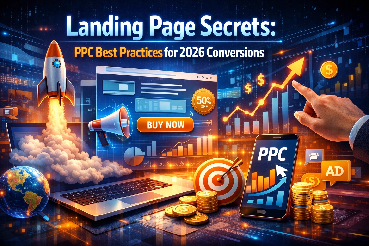
Let’s be real: in 2026, clicks aren’t just expensive: they’re an investment that most businesses are mismanaging. If you’re running PPC (Pay-Per-Click) campaigns on Google, Meta, or LinkedIn, and you’re still sending traffic to a generic "Contact Us" page or a cluttered homepage, you might as well be lighting your marketing budget on fire.
The digital landscape has shifted. With AI-assisted browsing and ultra-short attention spans, users decide whether to stay or bounce in less than two seconds. To win in 2026, your landing pages need to be more than just pretty; they need to be conversion machines built on data, psychology, and technical precision.
Here is the ultimate guide to the landing page secrets that are driving record-breaking conversions this year.
1. The Power of Perfect Message Alignment
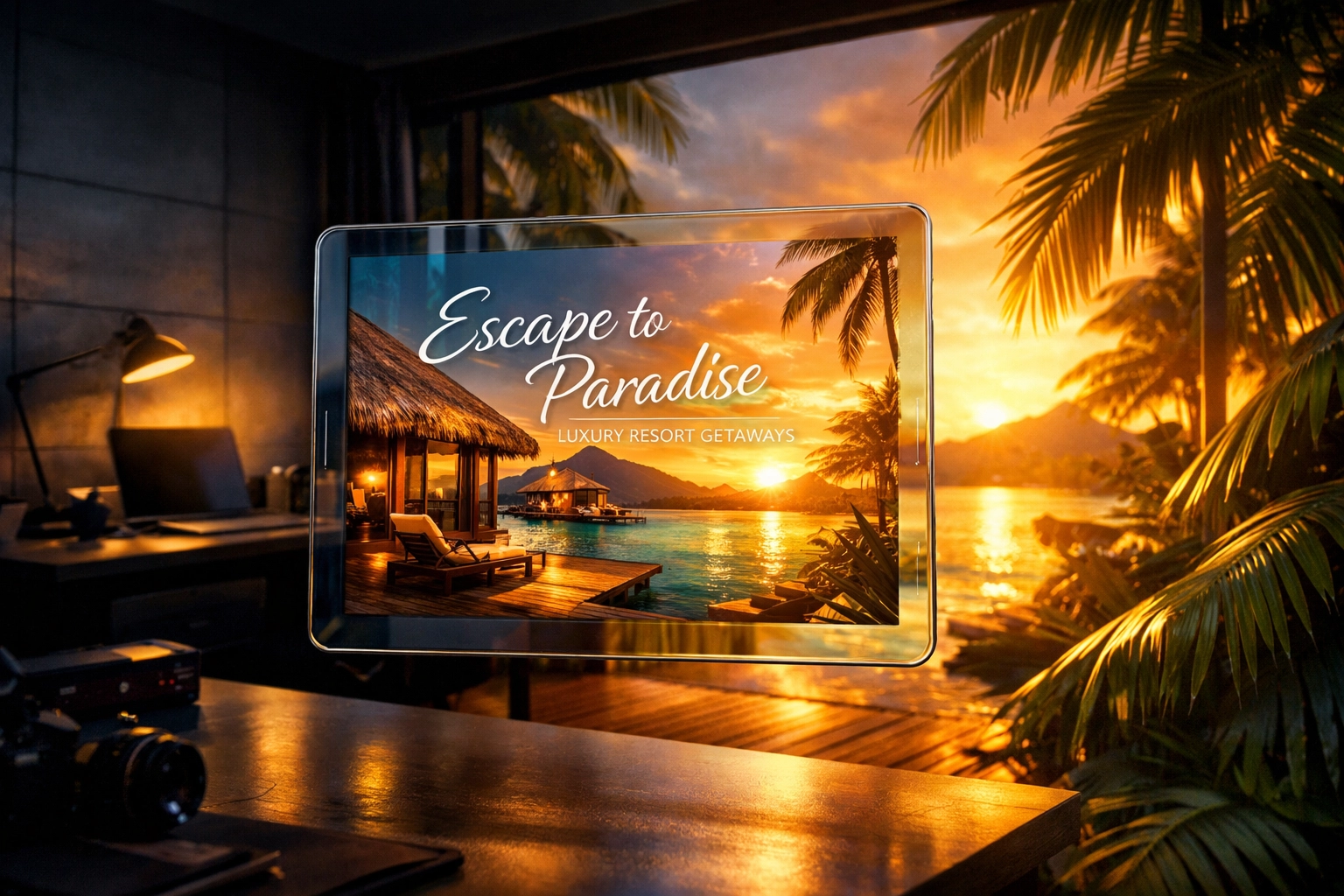
The biggest conversion killer isn't a bad layout; it’s cognitive dissonance. If your ad promises a "50% Discount on Leather Boots" but your landing page greets the user with a hero image of a generic warehouse and a headline about "Quality Footwear Since 1998," you’ve lost them.
In 2026, message alignment is non-negotiable. This means visual and verbal consistency between the ad the user clicked and the page they land on.
Verbal Consistency
Use the exact keywords from your ad copy in your landing page H1 headline. If your ad says "Affordable SaaS for Small Teams," your landing page shouldn't say "Scalable Enterprise Solutions." It sounds simple, but maintaining this thread of logic reduces the "bounce reflex."
Visual Consistency
If your ad uses a specific color palette or a particular style of photography, carry that over. The transition from the platform (like Instagram or Google) to your website should feel seamless, not like a jarring jump to a different company.
Dynamic Text Replacement (DTR)
High-performing teams are now using DTR at scale. This technology automatically changes the text on your landing page to match the search query of the user. If someone searches for "Best CRM for Realtors," DTR can swap your generic headline to specifically mention realtors. This level of personalization can boost Quality Scores and lower your Cost Per Acquisition (CPA) significantly.
2. Architecture of Focus: Kill the Navigation
One of the most effective "secrets" of 2026 is actually a subtraction. If you want people to convert, you have to stop giving them exits.
Standard websites have navigation bars, "About Us" links, social media icons, and footers full of distractions. On a PPC landing page, these are leaks in your funnel. Research continues to show that removing the navigation bar can increase conversions by as much as 336%.
The Rule of One
Every landing page should have:
- One clear value proposition.
- One primary Call to Action (CTA).
- Zero external links (except for legal requirements like Privacy Policies).
When you remove the "Choice Overload," you guide the visitor toward the only logical next step: clicking your button or filling out your form.
3. Mobile-First (Or Mobile-Only) UX
We’ve been talking about mobile optimization for a decade, but in 2026, 83% of PPC traffic comes from mobile devices. "Optimizing" for mobile isn't enough anymore; you should be designing for mobile first and desktop second.
The Thumb-Friendly Zone
Your most important elements: the CTA button and the lead form: need to be within the "natural thumb reach" of a user holding a phone with one hand. If your button is in the top right corner, you’re making the user work too hard.
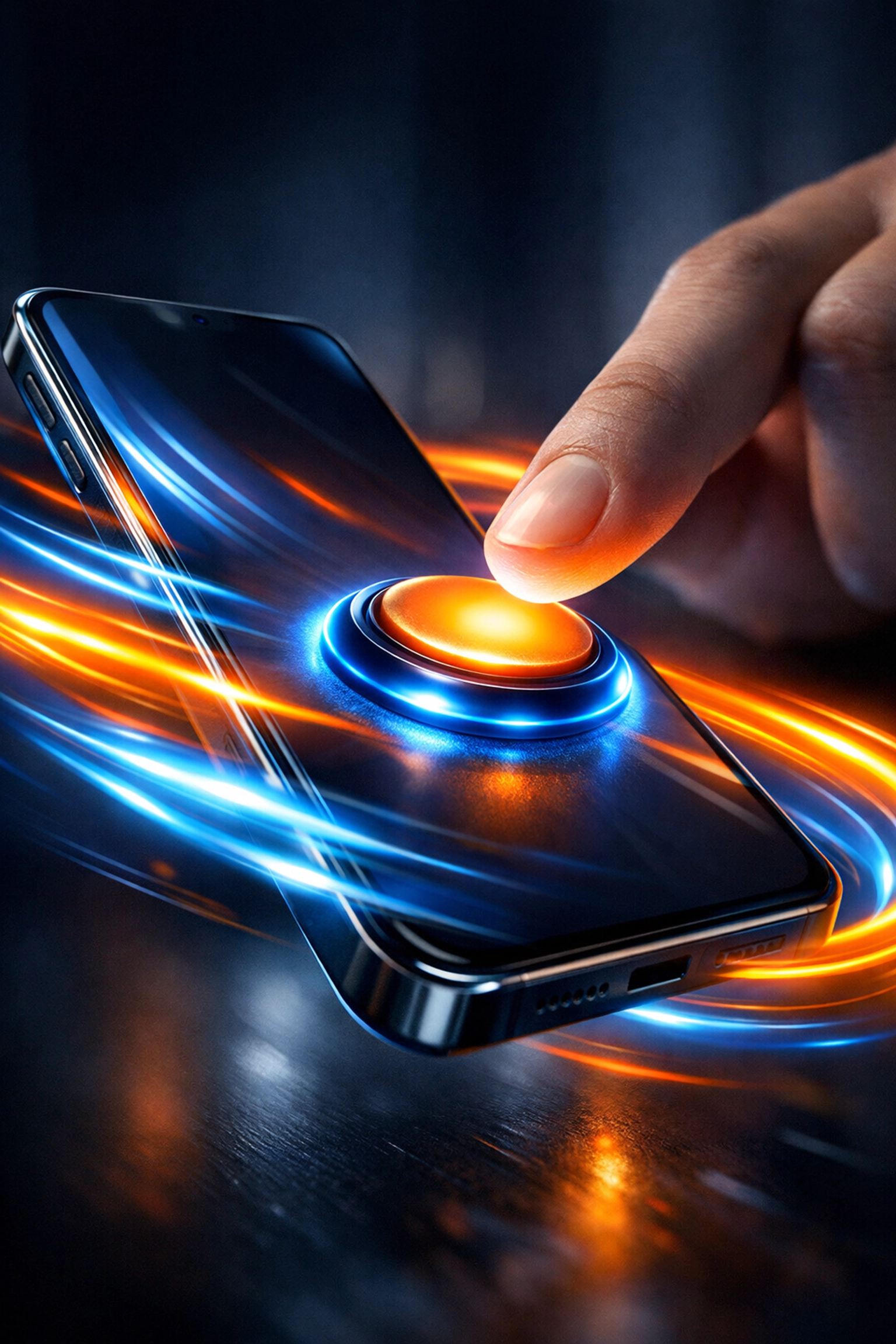
Speed is the Only Currency
If your page takes longer than 2 seconds to load, your conversion rate drops by roughly 20% for every additional second. In the world of 5G and fiber, patience is at an all-time low.
- Compress your images: Use WebP or AVIF formats.
- Limit scripts: Don't load 50 different tracking pixels if you only need three.
- Prioritize the "Fold": Load the content the user sees first before anything else.
| Load Time | Impact on Conversion |
|---|---|
| < 1 Second | Peak Performance (Highest ROI) |
| 2 Seconds | 15% Drop in Conversions |
| 3 Seconds | 30% Drop in Conversions |
| 5+ Seconds | 70% Bounce Rate |
4. The Psychology of Frictionless Forms
Forms are where most conversions go to die. Every field you add to a form is a hurdle. In 2026, the mantra is: 5 fields or fewer.
If you don't absolutely need their zip code, phone number, and company size to start the conversation, don't ask for them. You can gather more data later in the nurturing process.
Strategic Friction Reduction
- Use Smart Defaults: If you’re asking for a country, auto-detect it based on their IP.
- Mobile Keyboards: Ensure that when a user clicks a "Phone Number" field, the numeric keypad pops up automatically.
- Drop-downs vs. Typing: Avoid manual entry wherever possible. Use radio buttons or checkboxes. It’s much easier to tap a box than to type "Marketing Manager" on a tiny screen.
5. Visual Hierarchy and the "Fold" Myth
You’ve probably heard that everything important needs to be "above the fold" (the part of the screen visible without scrolling). While that’s still mostly true for your H1 and CTA, 2026 users are "scroll-happy." They are used to the infinite scroll of social media.
The key isn't cramming everything at the top; it’s creating a visual hierarchy that encourages scrolling.
whitespace is Your Friend
Don't be afraid of empty space. Whitespace directs the eye. If your CTA button is surrounded by a sea of white, it becomes the most important thing on the page.
High-Contrast CTAs
Your button shouldn't "match" your brand colors if your brand color is blue and your background is blue. Use a complementary color that pops. If your site is mostly blue and white, make that "Get Started" button orange or lime green. It should be the most vibrant element on the page.

6. Social Proof 2.0: Beyond Generic Quotes
In 2026, everyone is skeptical. A quote that says "Great service! – John D." is no longer believable. It looks fake, even if it’s real. To build trust, your social proof needs to be specific and quantified.
Quantified Results
Instead of "We helped this company grow," use "We helped Company X increase their lead volume by 42% in 90 days." Specificity creates authority.
Video Testimonials
A 30-second video of a real person talking about their experience is worth more than a thousand words of copy. It’s much harder to faking a video than a text snippet.
Trust Badges and Security
If you’re asking for credit card info or sensitive data, show the logos of your security providers (Norton, McAfee) or industry certifications. These "micro-signals" reduce the subconscious anxiety of clicking "Submit."
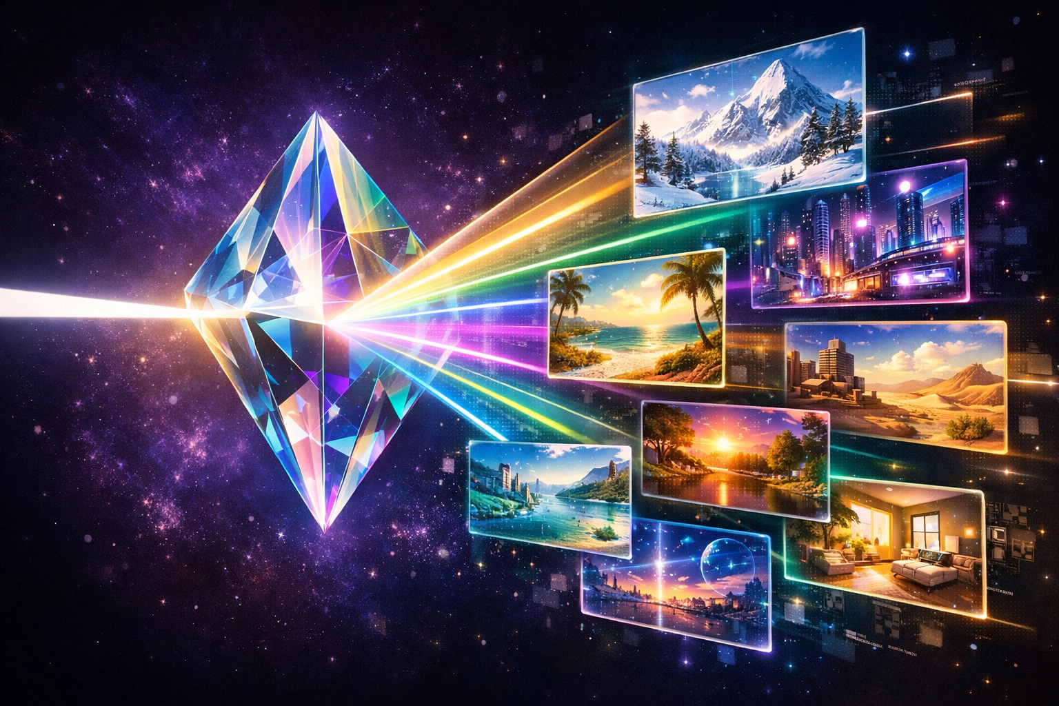
7. Hyper-Personalization with AI
The cutting edge of PPC in 2026 is dynamic personalization. We are moving away from "one page per campaign" to "one page per user intent."
By using data like the user's location, device, and previous browsing history, you can serve different content to different people. For example, if a user is clicking an ad in rainy Seattle, your hero image could show someone using your product indoors. If they are in sunny Miami, show it outdoors.
Personalized landing pages can improve conversions by over 200%. When a visitor feels like a page was built specifically for their problem, the "sale" becomes a "solution."
8. Continuous Optimization: The A/B Testing Loop
The "perfect" landing page doesn't exist; there is only the "better" landing page. Best practices are just a starting point. To truly dominate your niche, you need to be testing.
What to Test First:
- The Headline: This has the biggest impact. Try a "Benefit-focused" headline vs. a "Problem-focused" one.
- The CTA Button: Test the text ("Get My Guide" vs. "Download Now") and the color.
- The Hero Image: Test a photo of a person using the product vs. a product screenshot.
Don't change everything at once. Change one variable, run it until you have a statistically significant amount of traffic, and see which one wins. Then, take the winner and test something else against it. This is how you move from a 3% conversion rate to a 10% conversion rate over time.
Summary Checklist for 2026
- Message Match: Does the headline match the ad?
- Focus: Is the navigation bar removed?
- Speed: Does it load in under 2 seconds on mobile?
- Friction: Is the form 5 fields or fewer?
- Contrast: Does the CTA button stand out clearly?
- Trust: Are there specific, data-backed testimonials?
Winning at PPC in 2026 is about respect: respecting the user’s time, their attention, and their intelligence. By following these best practices, you aren't just "getting clicks"; you're building a bridge between a person with a problem and your business as the solution.
About the Author: Malibongwe Gcwabaza
Malibongwe Gcwabaza is the CEO of blog and youtube, a leading digital strategy firm dedicated to simplifying the complexities of modern marketing. With a focus on data-driven growth and high-impact content, Malibongwe helps businesses navigate the ever-changing landscape of PPC and Conversion Rate Optimization. When he's not deep in analytics, he's exploring the intersection of AI and human creativity to build the next generation of digital experiences.